Auto-generated docs
Auto-generated docs from the CLI.
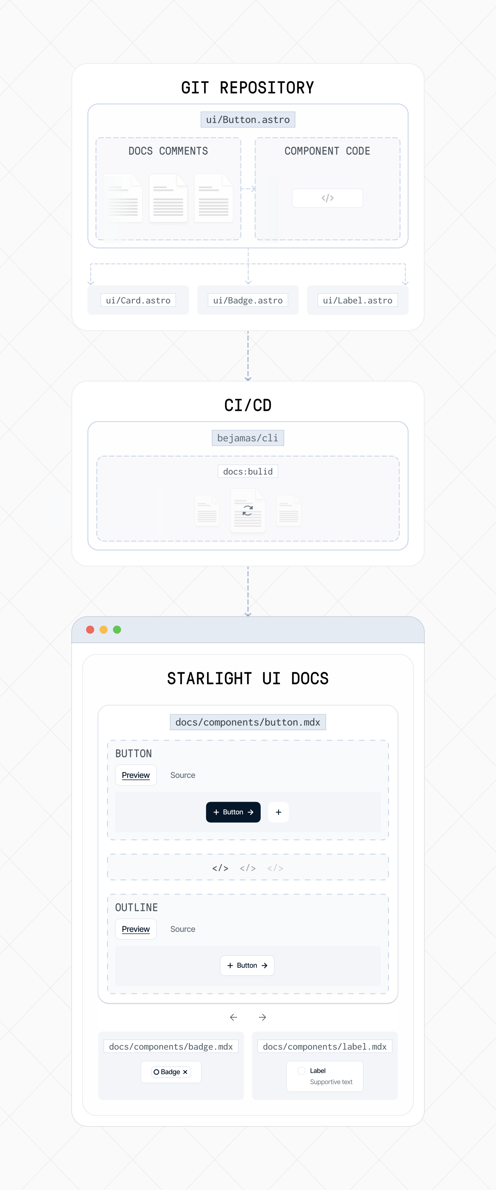
bejamas/ui supports auto-generated documentation based on structured comments inside each component.
When you run the CLI, it scans your components, extracts those comments, and generates MDX pages. Your Starlight docs site then picks up these MDX files like any other content.
This keeps your documentation:
- always in sync
- version-friendly
- easy to maintain
- fully Astro-native

Build the docs
Section titled “Build the docs”You can generate all component docs using the CLI:
bunx bejamas@latest docs:buildnpx bejamas@latest docs:buildpnpm dlx bejamas@latest docs:buildyarn dlx bejamas@latest docs:buildOptional flags
Section titled “Optional flags”-c, --cwd→ specify the path to your UI components-o, --out→ specify where generated MDX files should be written
bunx bejamas@latest docs:build -c ./packages/ui -o ./docs/componentsnpx bejamas@latest docs:build -c ./packages/ui -o ./docs/componentspnpm dlx bejamas@latest docs:build -c ./packages/ui -o ./docs/componentsyarn dlx bejamas@latest docs:build -c ./packages/ui -o ./docs/componentsConfiguration via components.json
Section titled “Configuration via components.json”By default, the CLI reads configuration from a components.json file at the root of your project.
The components.json file configures how the docs generator behaves (paths, aliases, styling). Most projects won’t need to change it.
{ "$schema": "https://ui.bejamas.com/schema.json", "style": "bejamas-juno", "tailwind": { "config": "", "css": "src/styles/global.css", "baseColor": "neutral", "cssVariables": true, "prefix": "" }, "iconLibrary": "lucide", "aliases": { "components": "@/components", "utils": "@bejamas/ui/lib/utils", "ui": "@bejamas/ui/components", "lib": "@bejamas/ui/lib", "hooks": "@bejamas/ui/hooks", "docs": "@/content/docs/components" }, "registries": {}}Writing documentation inside components
Section titled “Writing documentation inside components”Documentation is stored directly inside the component file using structured comment tags. These tags form the source of your generated docs pages.
Supported tags
Section titled “Supported tags”These tags control what content appears in the generated MDX page.
-
@component— canonical component name -
@title— human-readable title for the docs page -
@description— short description shown at the top -
@preview— main interactive preview example shown at the top -
@usage— usage example (rendered as a code block) -
@examples— additional examples and sections
Full example
Section titled “Full example”Below is a complete example from the Button component in the bejamas/ui package.
---/** * @component Button * @title Button * @description Displays a button or a component that looks like a button. * * @preview * * <div class="flex flex-wrap items-center gap-2 md:flex-row"> * <Button>Button</Button> * <Button variant="outline" size="icon" aria-label="Submit"> * <ArrowUpIcon /> * </Button> * </div> * * @usage * * ```astro * --- * import Button from '@/ui/components/Button.astro'; * --- * * <Button>Click me</Button> * ``` * * ## Link * * You can use the `as` prop to render the component as an anchor. * * ```astro * --- * import Button from '@/ui/components/Button.astro'; * --- * * <Button as="a" href="https://bejamas.com">Click me</Button> * ``` * * @examples * * ### Variants * * <div class="flex gap-3 items-center"> * <Button variant="default">Default</Button> * <Button variant="secondary">Secondary</Button> * <Button variant="outline">Outline</Button> * <Button variant="ghost">Ghost</Button> * <Button variant="destructive">Destructive</Button> * </div> * * ### Sizes * * <div class="flex flex-col items-start gap-8 sm:flex-row"> * <div class="flex items-start gap-2"> * <Button size="sm" variant="outline"> * Small * </Button> * <Button size="icon-sm" aria-label="Submit" variant="outline"> * <ArrowUpRightIcon /> * </Button> * </div> * <div class="flex items-start gap-2"> * <Button variant="outline">Default</Button> * <Button size="icon" aria-label="Submit" variant="outline"> * <ArrowUpRightIcon /> * </Button> * </div> * <div class="flex items-start gap-2"> * <Button variant="outline" size="lg"> * Large * </Button> * <Button size="icon-lg" aria-label="Submit" variant="outline"> * <ArrowUpRightIcon /> * </Button> * </div> * </div> * * ### With badge * * <Button variant="default"> * Click me * <Badge variant="secondary">Value</Badge> * </Button> * * ### Destructive * * <Button variant="destructive">Click me</Button> * * ### Outline * * <Button variant="outline">Click me</Button> * * ### Secondary * * <Button variant="secondary">Click me</Button> * * ### Ghost * * <Button variant="ghost">Click me</Button> * * ### Link * * <Button variant="link">Click me</Button> * * ### Default * * <Button>Click me</Button> * */---You can see the final generated documentation page here.
Summary
Section titled “Summary”Documentation is written inside component files.
The CLI extracts comments and builds MDX docs automatically.
Output integrates perfectly with Astro Starlight.
No Storybook, no React, no overhead — just clean, self-contained docs.